2026
Methods for Differential Expression Analysis
Experimental design: 2 groups × 3 biological replicates = 6 samples total, 5 genes.
2025
Workflow | Containers for Reproducible Bioinformatics Environments
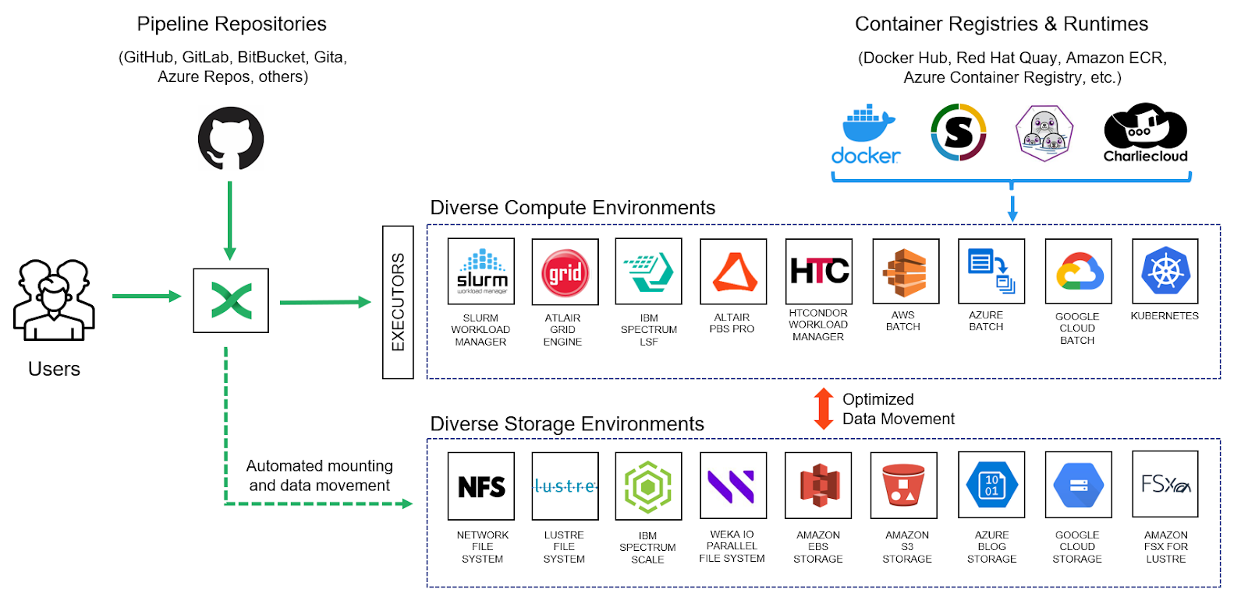
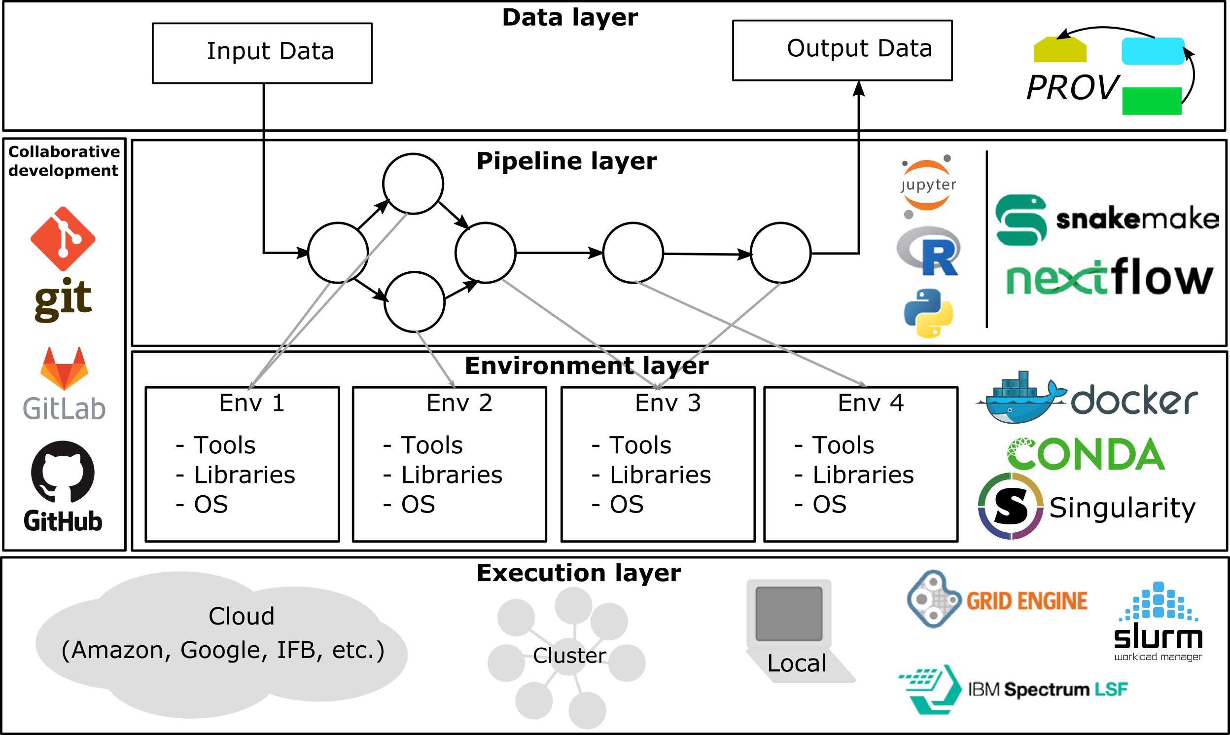
How to integrate Docker & Singularity/Apptainer containers into Snakemake and Nextflow for reproducible, traceable bioinformatics workflows.
Containers | Environment management in bioinformatics data analysis
Practical guide to reproducible bioinformatics environments using Docker and Singularity/Apptainer: concepts, pitfalls, examples, HPC integration, and workflow tooling.
Bulk RNA-seq and its Applications
* Technical replicates: use the same biological sample to repeat the technical or experimental steps in order to accurately measure technical variation and remove it during…
Copy number alteration (CNA) refers to changes in the number of copies of a particular gene or genomic region. These alterations can lead to an increase (amplification) or…
Commonly Used SLURM Commands in HPC
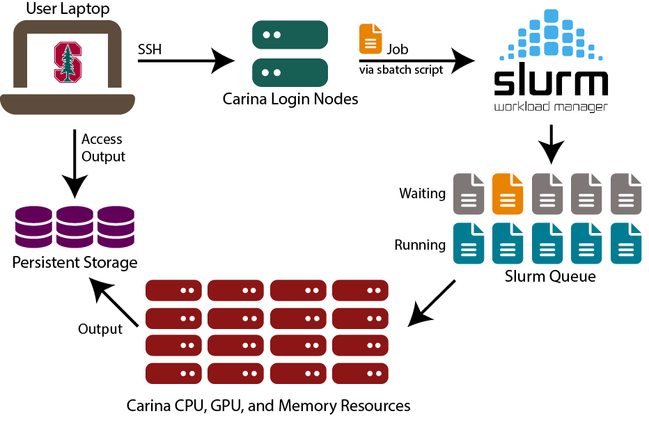
SLURM (Simple Linux Utility for Resource Management) is a powerful and flexible job scheduler used in High-Performance Computing (HPC) environments. It helps manage and…
2024
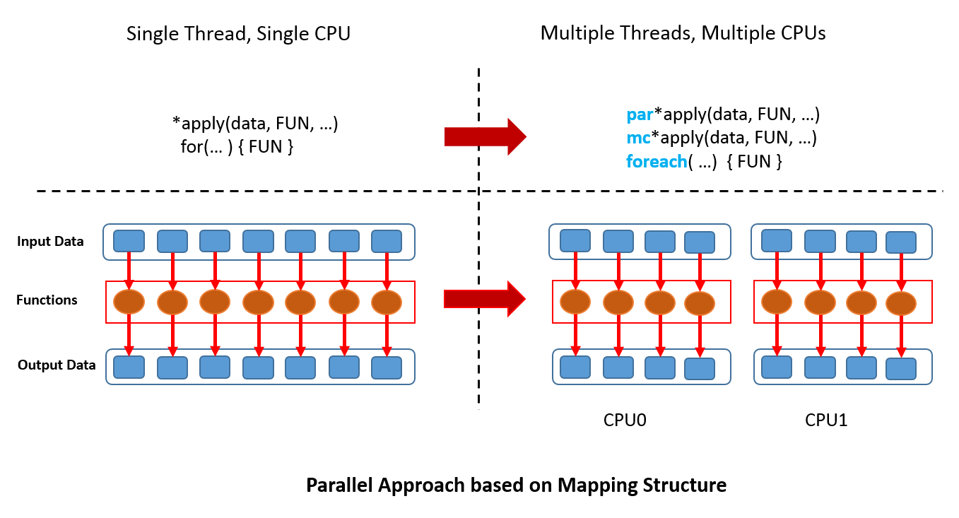
Parallel processing is a powerful technique to speed up computations by utilizing multiple CPU cores simultaneously. In R, several functions and packages enable parallel…
Plot scatter plot with 2D density
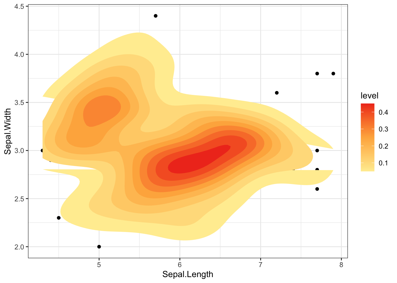
2d density plot is helpful for examining the connection between 2 numerical variables. It divides the plot area into several little fragments to prevent overlapping (as in the scatterplot next to it) and shows the number of points in each fragment.
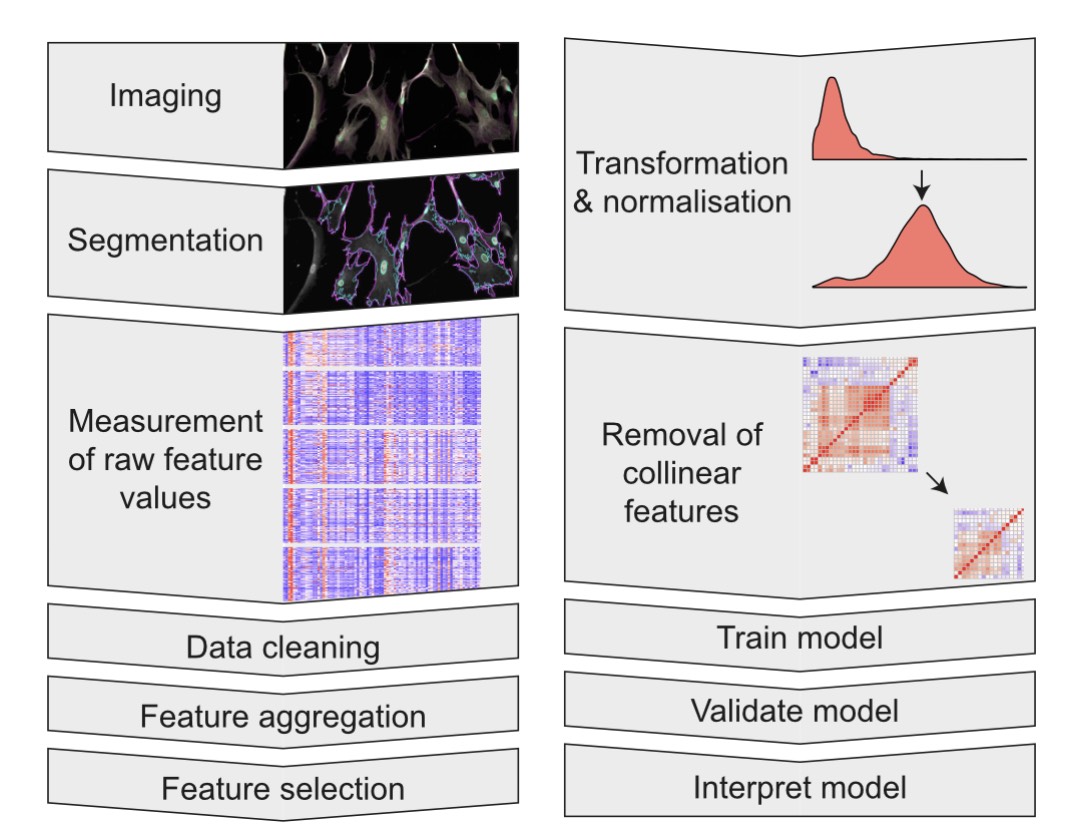
Analysis of single cell RNA-seq data with {SingleCellExperiment}
Using SingleCellExperiment object to analysis single cell data
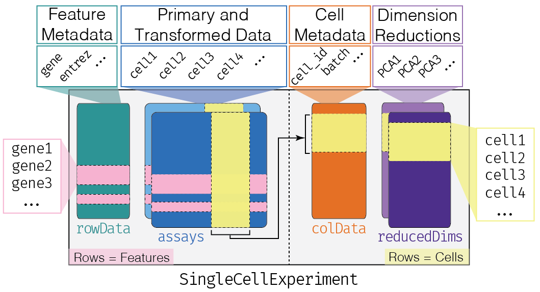
SingleCellExperiment | Practise Single-cell RNA-seq data analysis
All the contents are credited or adapted from Orchestrating Single-Cell Analysis with Bioconductor for leaning purpose.
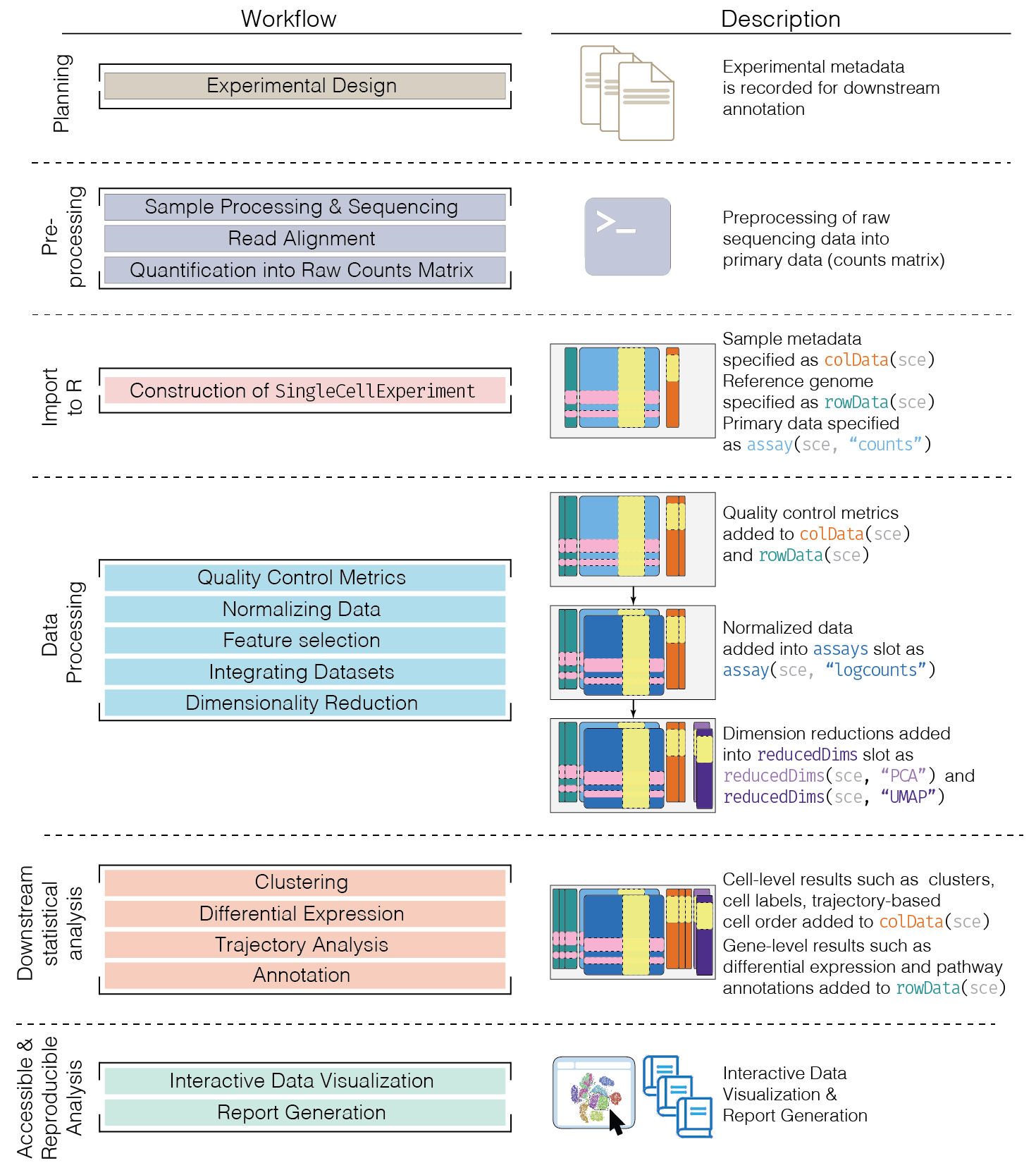
2023
Pseudobulk differential expression analysis
Pseudobulk differential expression analysis is a method used to analyze single-cell RNA-seq data by aggregating counts at the sample level. This approach helps to reduce the…

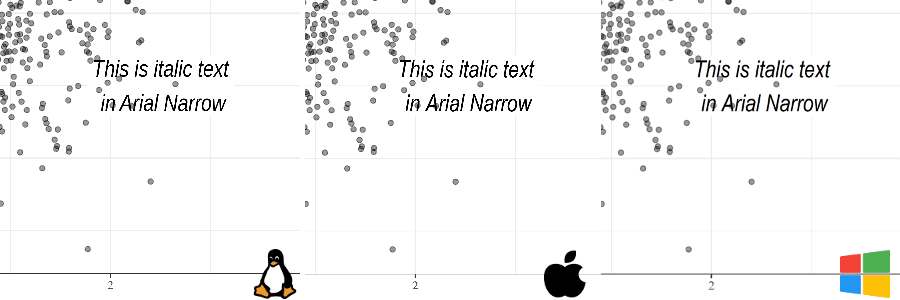
Save ggplot2 plots with custom fonts using Cairo graphics across OS
The Cairo graphics library makes it easy to embed custom fonts in PDFs and create high resolution PNGs (with either AGG or Cairo).
Customization of Seurat plots using ggplot2
The DimPlot, FeaturePlot, Dotplot, VlnPlot, and DoHeatmap from Seurat can be further customized with ggplot2.
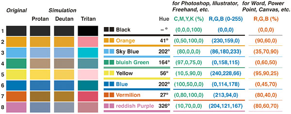
Use colorblind-friendly palette for visualization
Use ggplot2 to make nice coordinate, colors, and size with friendly colors.
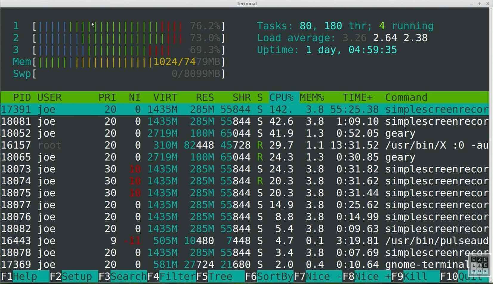
Visual the usage of CPU and memory with htop
htop is an interactive process viewer and system monitor.
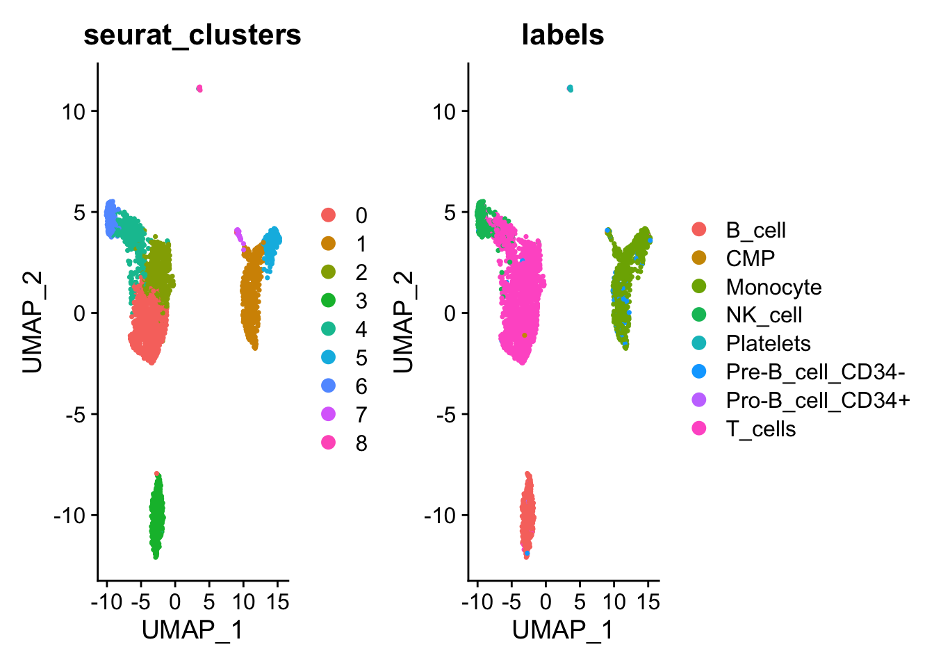
Practise Seurat for single cell data analysis
Practise scRNA data analysis with Genome Medicine using Seurat package.

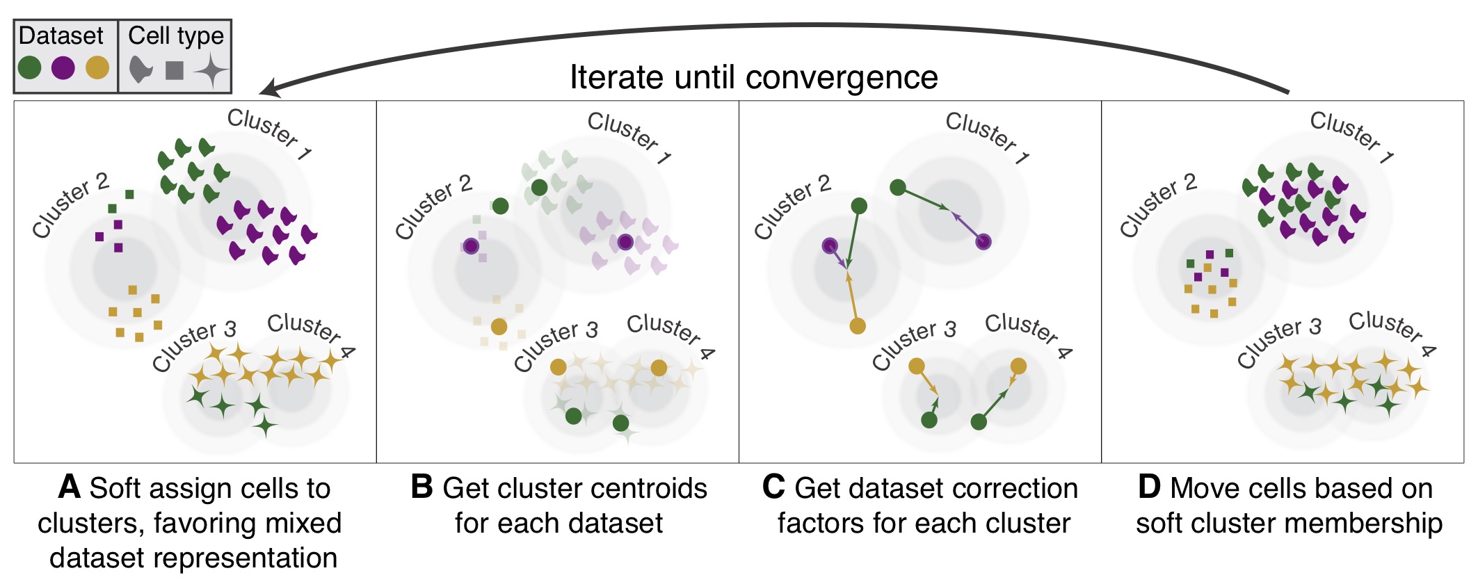
Learning Harmony to integrate single cell RNA-seq data for batch borrection and meta analysis
Harmony allow integrating data across several variables (for example, by experimental batch and by condition), and significant gain in speed and lower memory requirements for integration of large datasets.
Learning Seruat for scRNA-seq data analysis
The package that must to learn for scRNA-seq data analysis.
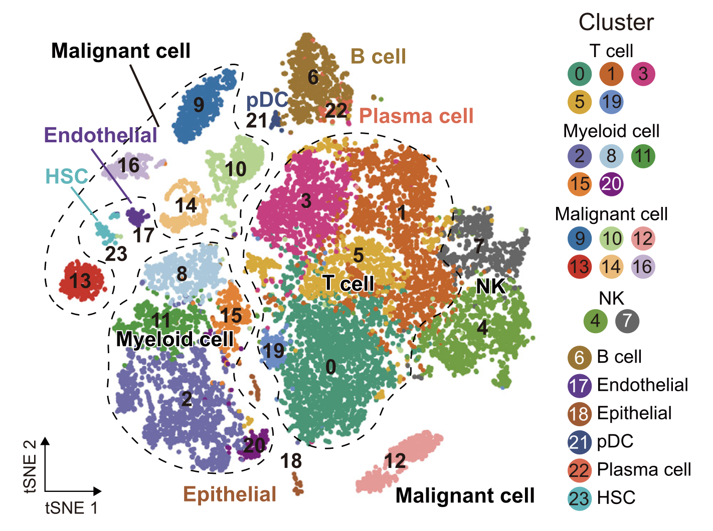
Using ggbeeswarm plot to represent categorical data
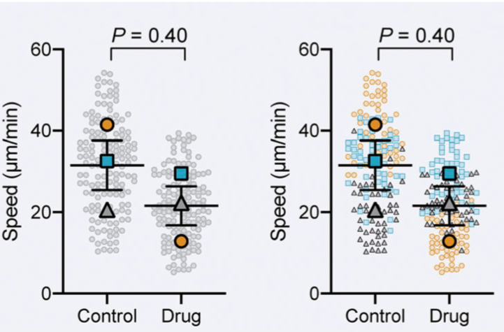
The plot shows all data points with a color-code for each replicate, as well as the averages of each replicate, the total average and the SEM.
Best Practise for R programming
Writing clean, efficient, and maintainable code is crucial for any programming language, and R is no exception. In this blog post, we will discuss best practices for R…

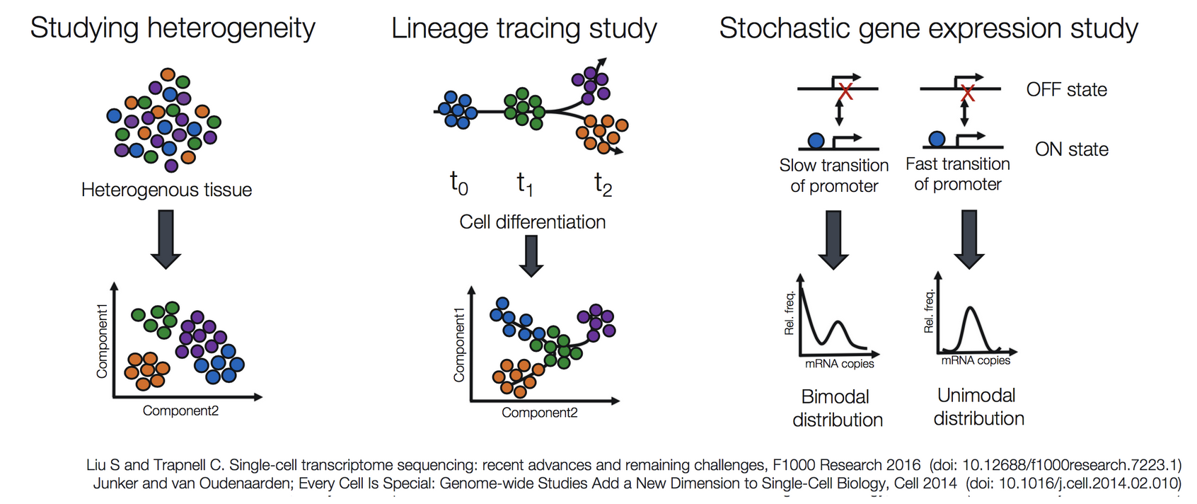

Combat to remove batch effects in high-throughput experiments
Comat models batch effects as multiplicative and additive noise to the biological signal and uses a Bayesian framework to fit linear models that factor such noise out of the readouts.
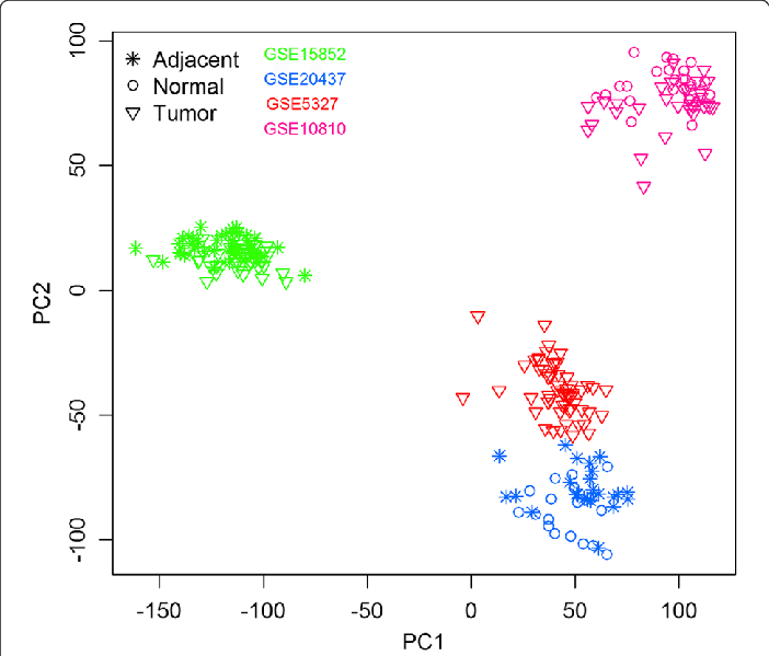
Using renv to manage R environment for reproducible coding
R works by defaultly by installing packages to a central library and shares them between the projects. It sounds like a good and time-saving feature. After all, you don’t…

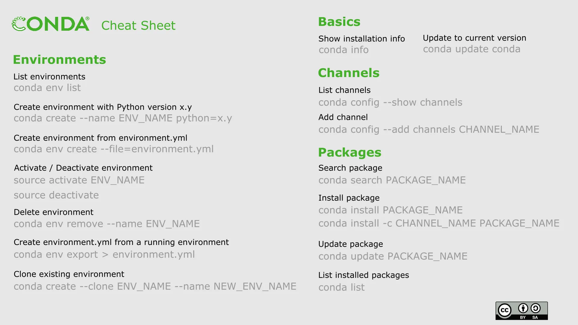
Install Conda to manage R/Python environments and packages
Sometimes, We need to install R in the Linux server, but we don't the root permission
Learning [ropls] for multivariate analysis and feature selection of omics data
PCA (also called eigenvector analysis) is unsupervised pattern recognition technique mostly utilized as data reduction and modelling technique. It determines the degree or…
![Learning [ropls] for multivariate analysis and feature selection of omics data Learning [ropls] for multivariate analysis and feature selection of omics data](../blog/2023/07/05/plsda.png)
Analyze Omics data using [structToolbox]
The MTBLS79 dataset represents a systematic evaluation of the reproducibility of a multi-batch direct-infusion mass spectrometry (DIMS)-based metabolomics study of cardiac…
![Analyze Omics data using [structToolbox] Analyze Omics data using [structToolbox]](../blog/2023/07/04/pca.png)
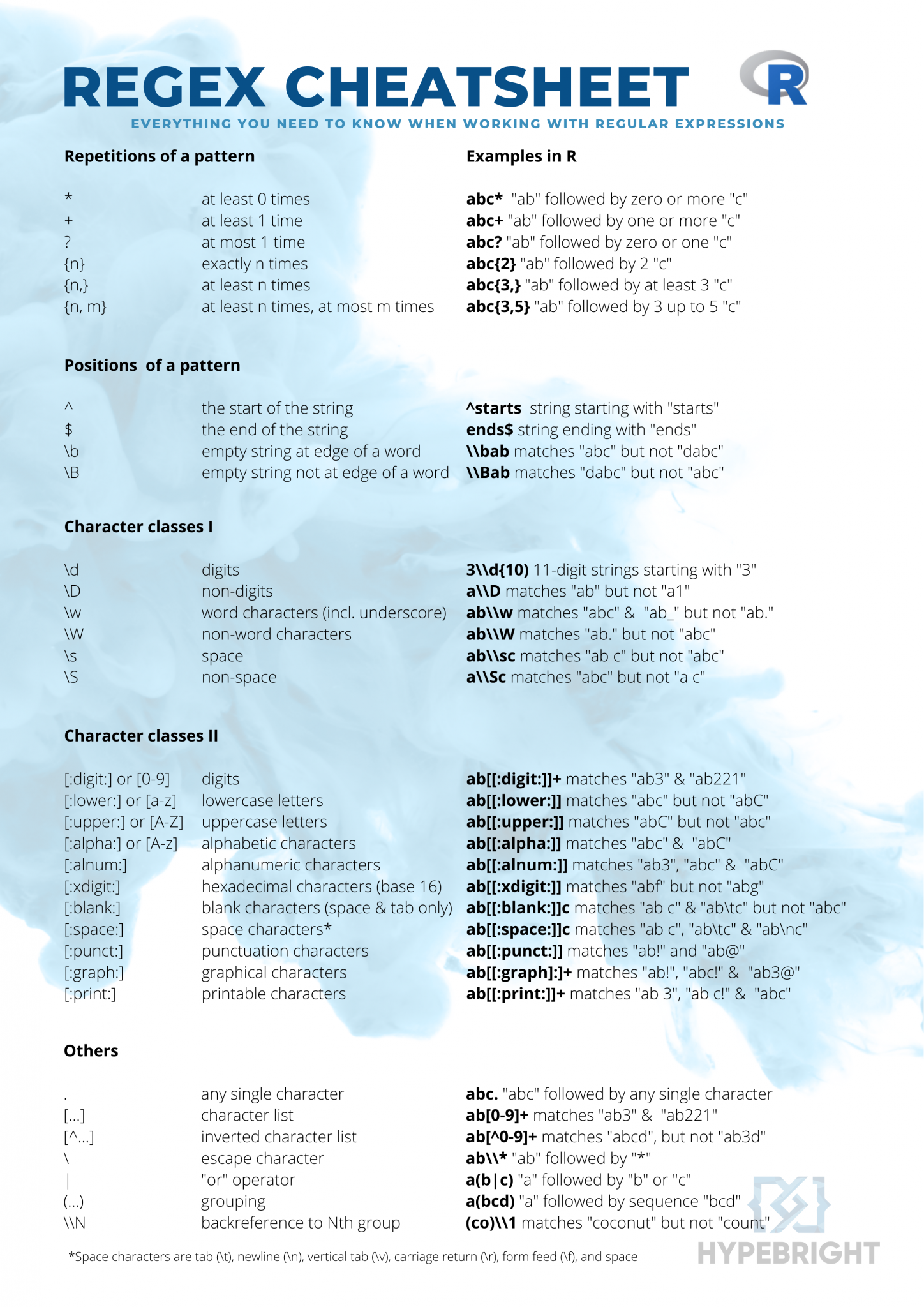
Regular expressions are also called regex or regexp. A regex is a text string that defines a search pattern. Regex can be used to manipulate and extract information from…
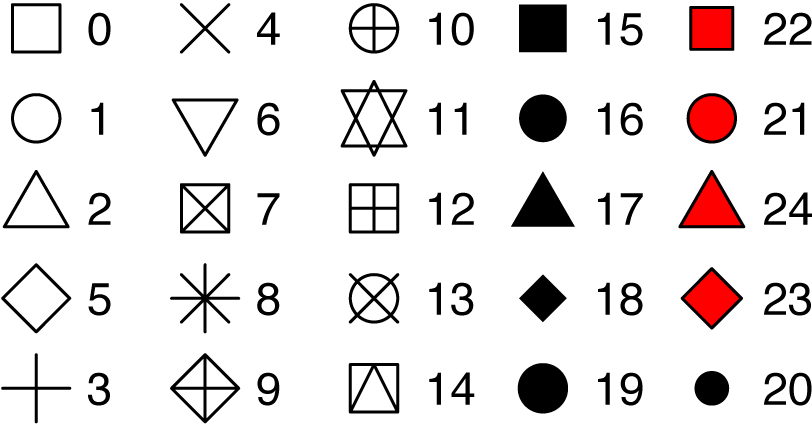
Tips for using shapes for ggplot2
Change ggplot point shape values. Use special point shapes, including pch 21 and pch 24. The interesting feature of these point symbols is that you can change their background fill color and, their border line type and color
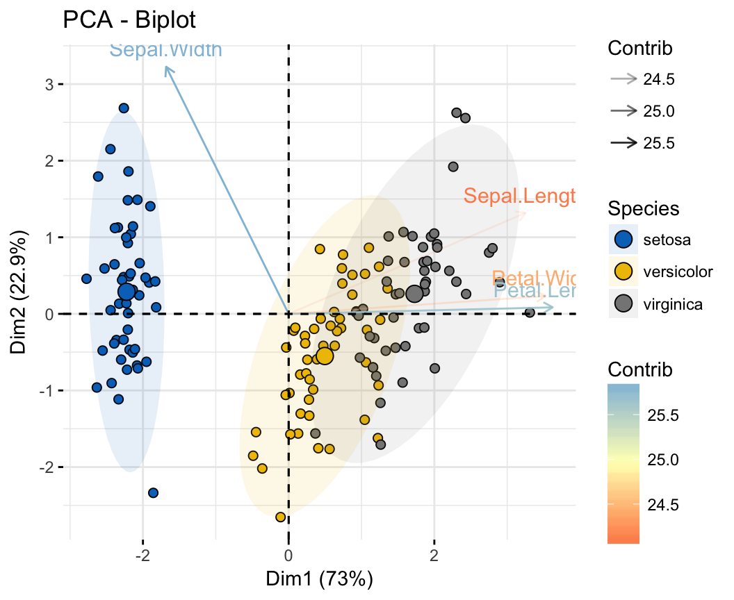
PCA, PLS-DA and OPLS-DA analysis using [ropls]
Arguments to customize the PCA graph of variables and individuals.
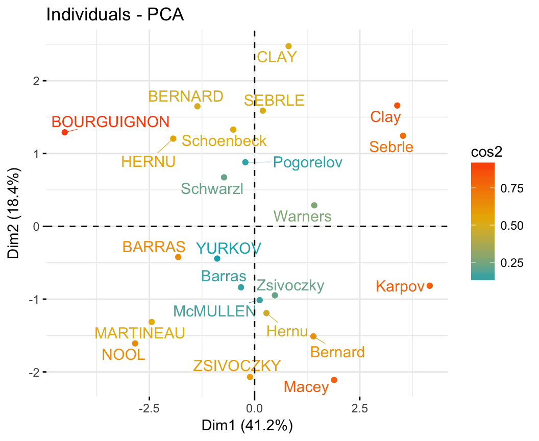
Perform Principal Component Analysis
Principle component methods are used to summarize and viusalize the information contained in a large multivariate datasets.
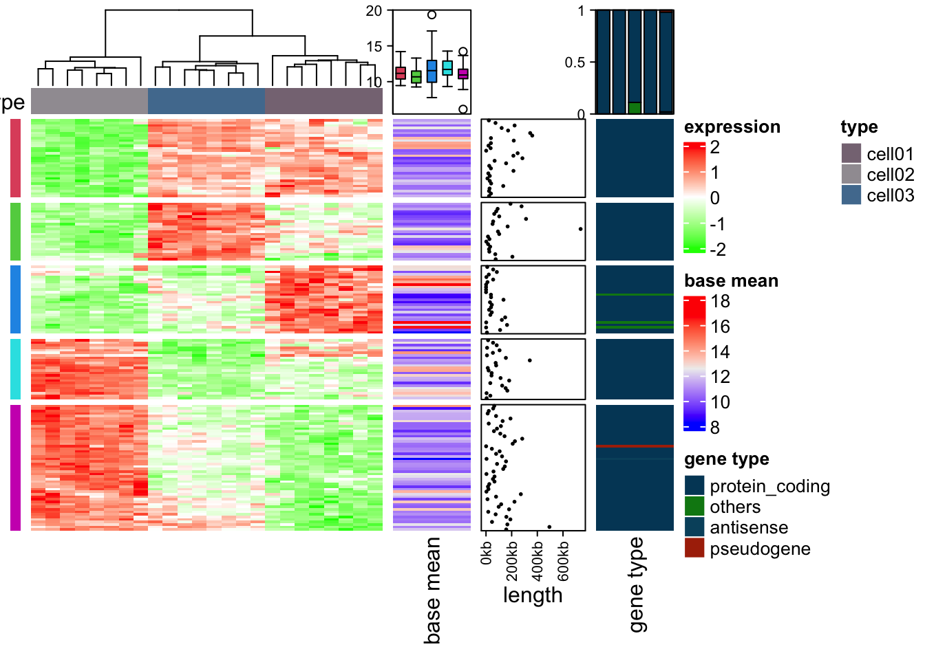
Make heatmap using ComplexHeatmap
Heatmap (or heat map) is way to visualize hierarchical clustering. It’s also called a false colored image, where data values are transformed to color scale.
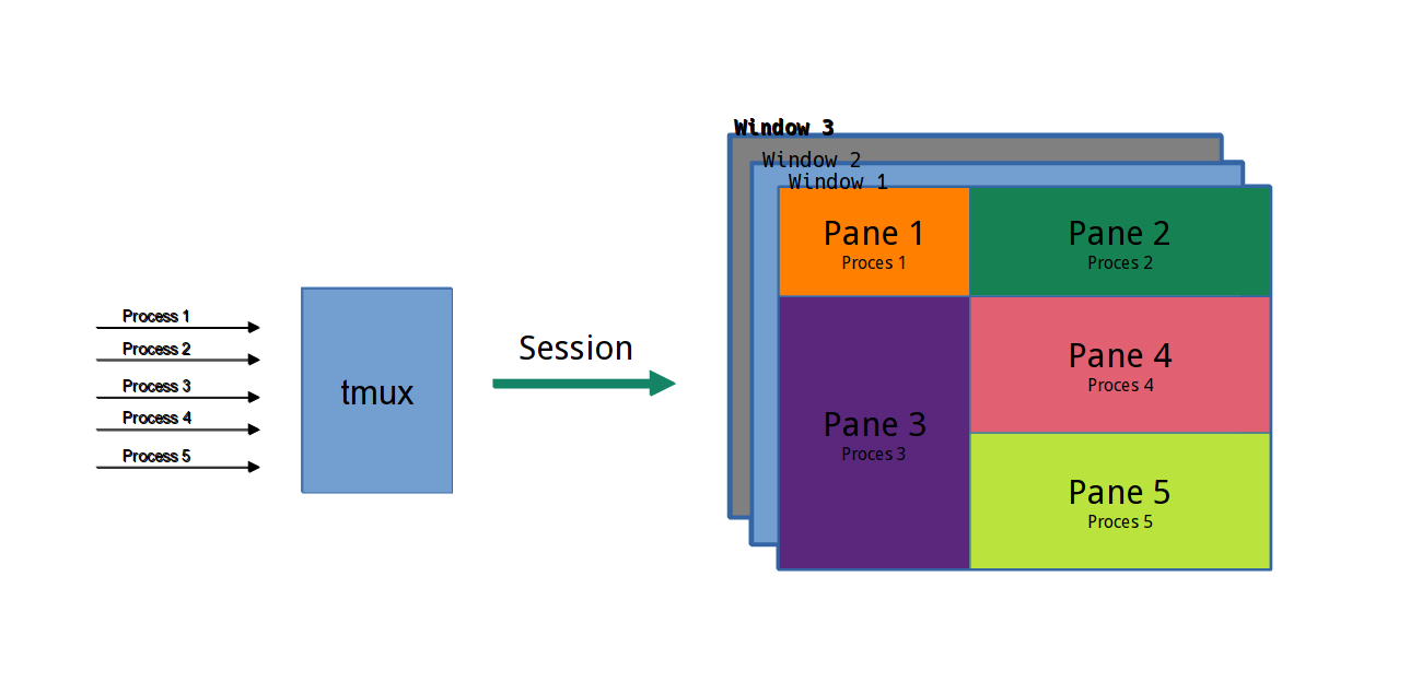
Using Tmux and Screen for Persistent Terminal in VSCode Remote Session
The solution is to set the default terminal provider on the remote settings to be tmux, and have it attach to either an existing session named main, or create a new one if it doesn't exist.
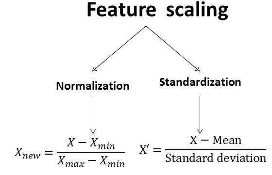
The best way to perform feature scaling using R
Data normalization methods are used to make variables, measured in different scales, have comparable values. This preprocessing steps is important for clustering and heatmap visualization, principal component analysis and other machine learning algorithms based on distance measures.
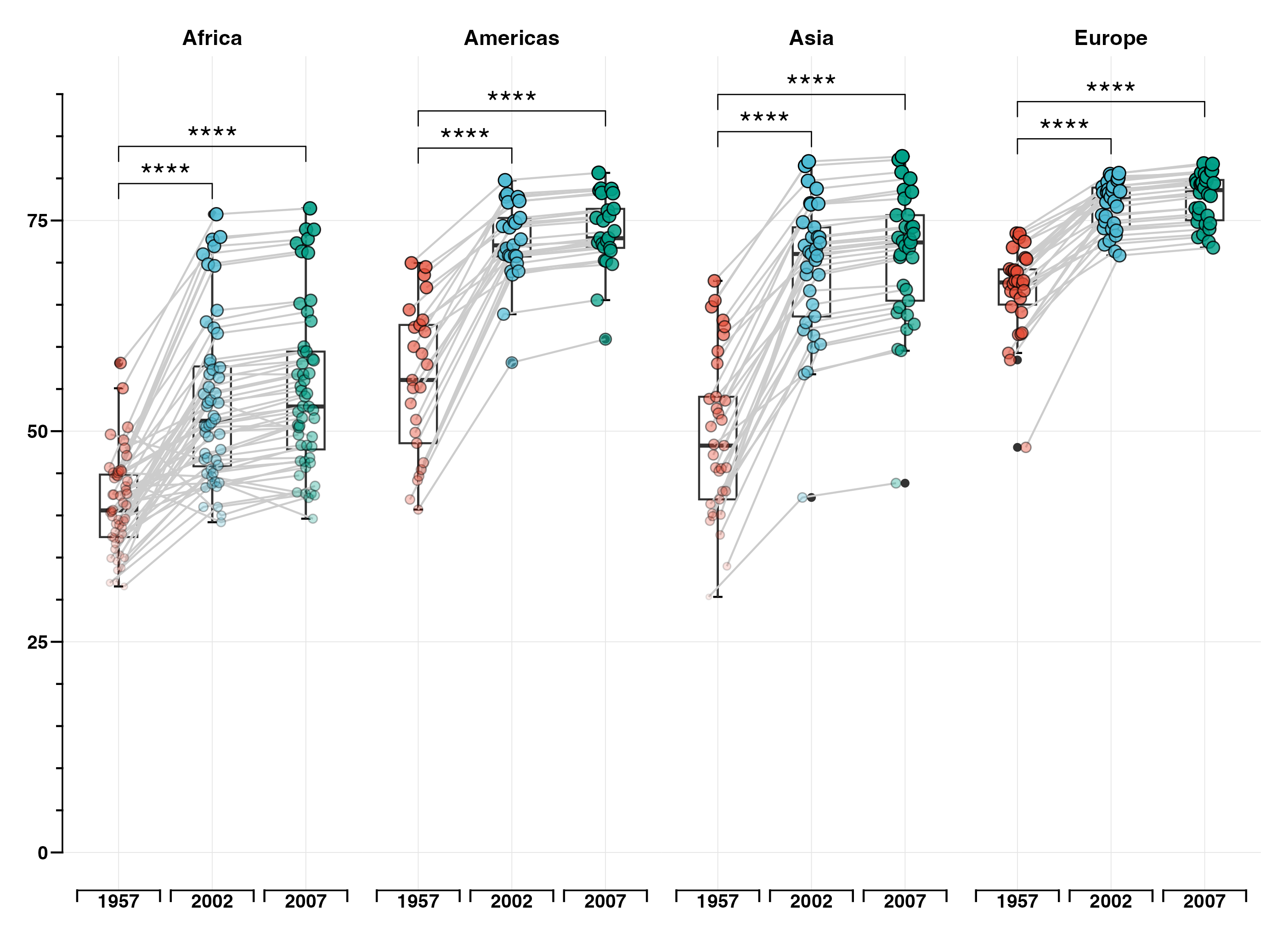
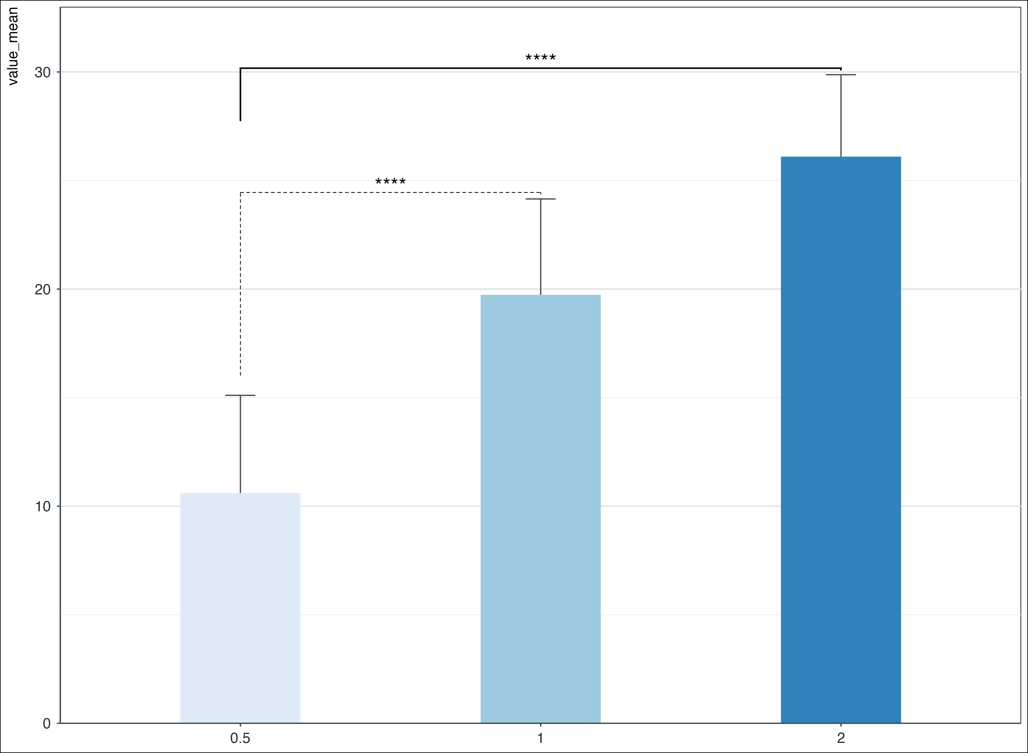
Add p-value and significant level at facet boxplot
How to compute and add p-values to basic ggplots using the rstatix and the ggpubr R packages.
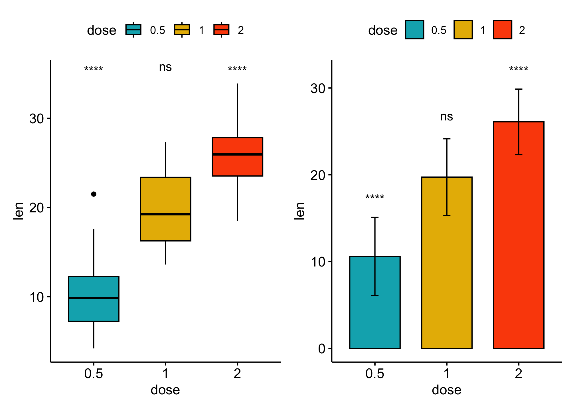
Add p-values onto basic barplot or boxplot
How to compute and add p-values to basic ggplots using the rstatix and the ggpubr R packages.
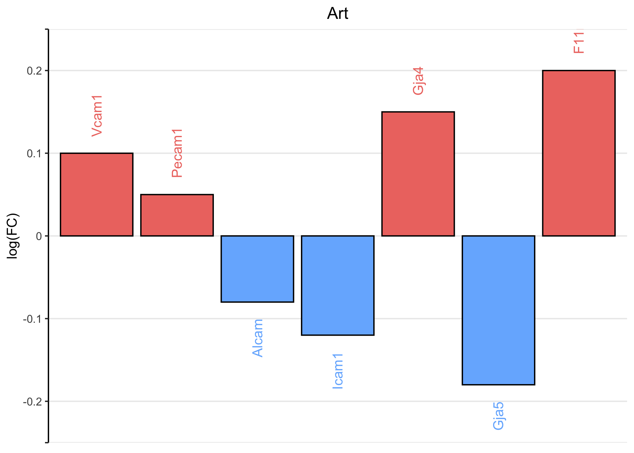
Barplot with negative and positive value
Coloring Negative and Positive Bars Differently using ggplot2
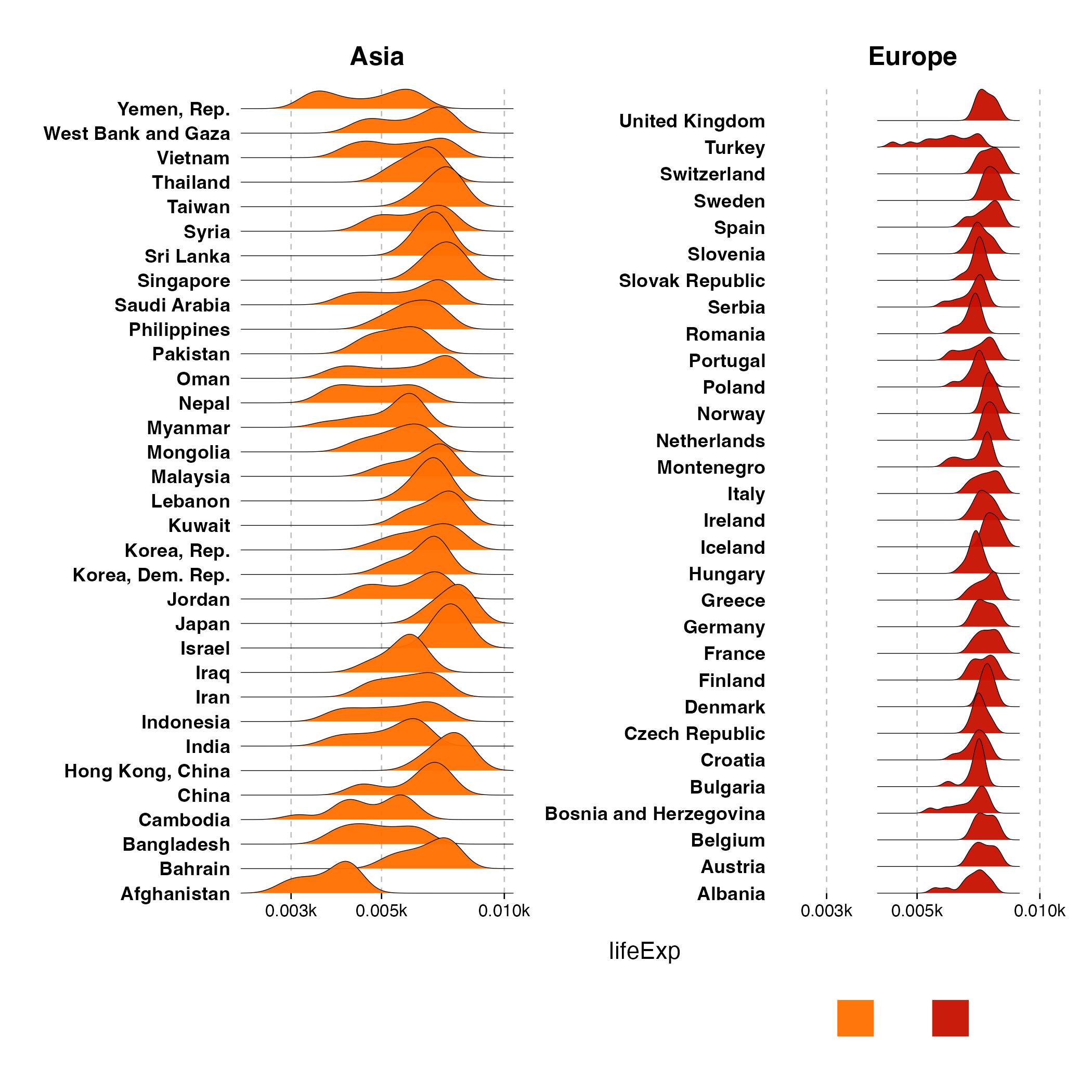
Visualizing changes in distributions over time or space nicely usning ggrigges.
Make the widths of bars to be same when the level of subgroups are not equal
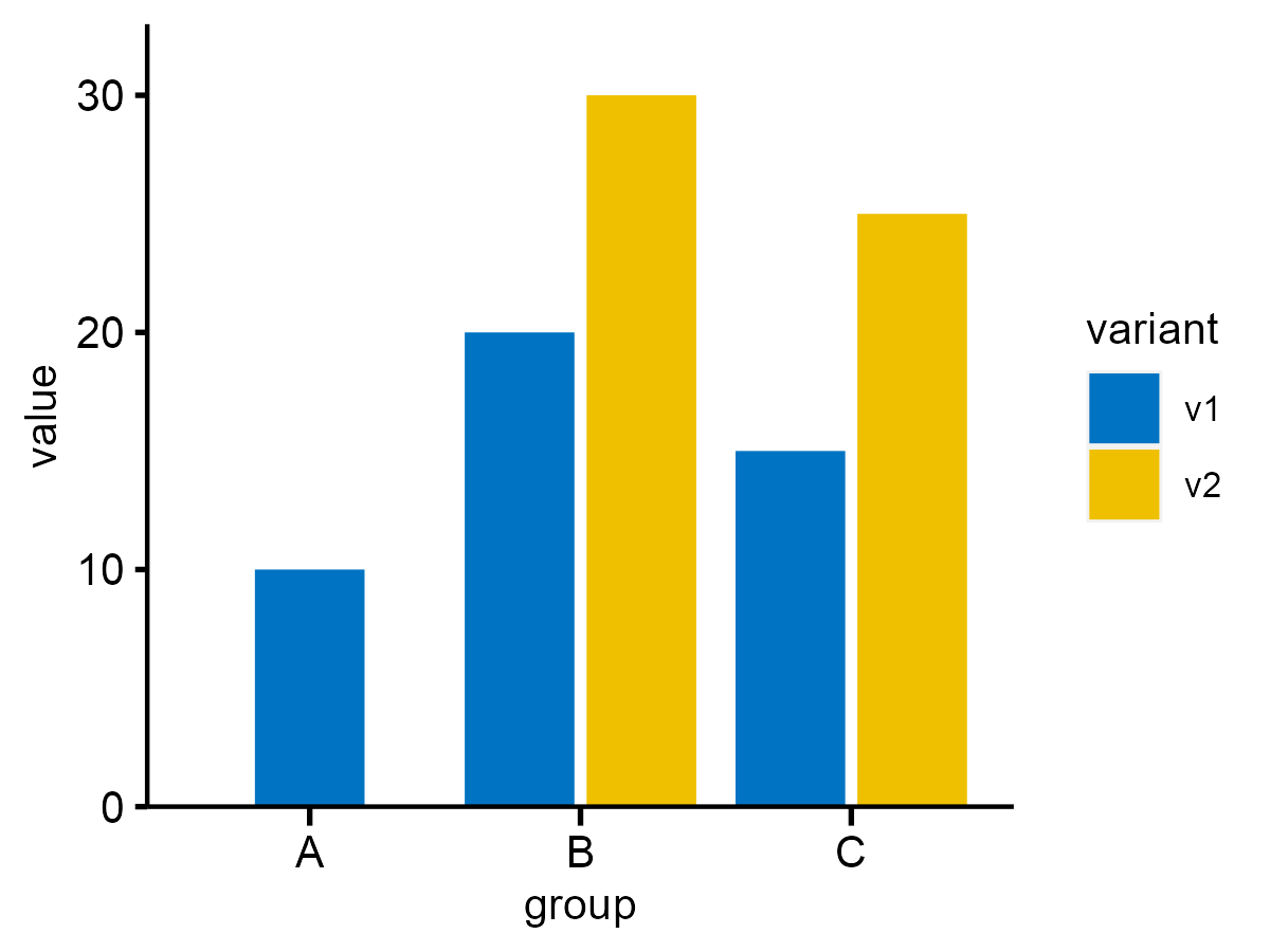
ggplot2 with p-value and significant level
A sample example to add p-value and significant level to barpot.
2022
Setup SSH to work in remote server
The following setup will help to ogin to server without using password and IP address with SSH remote key

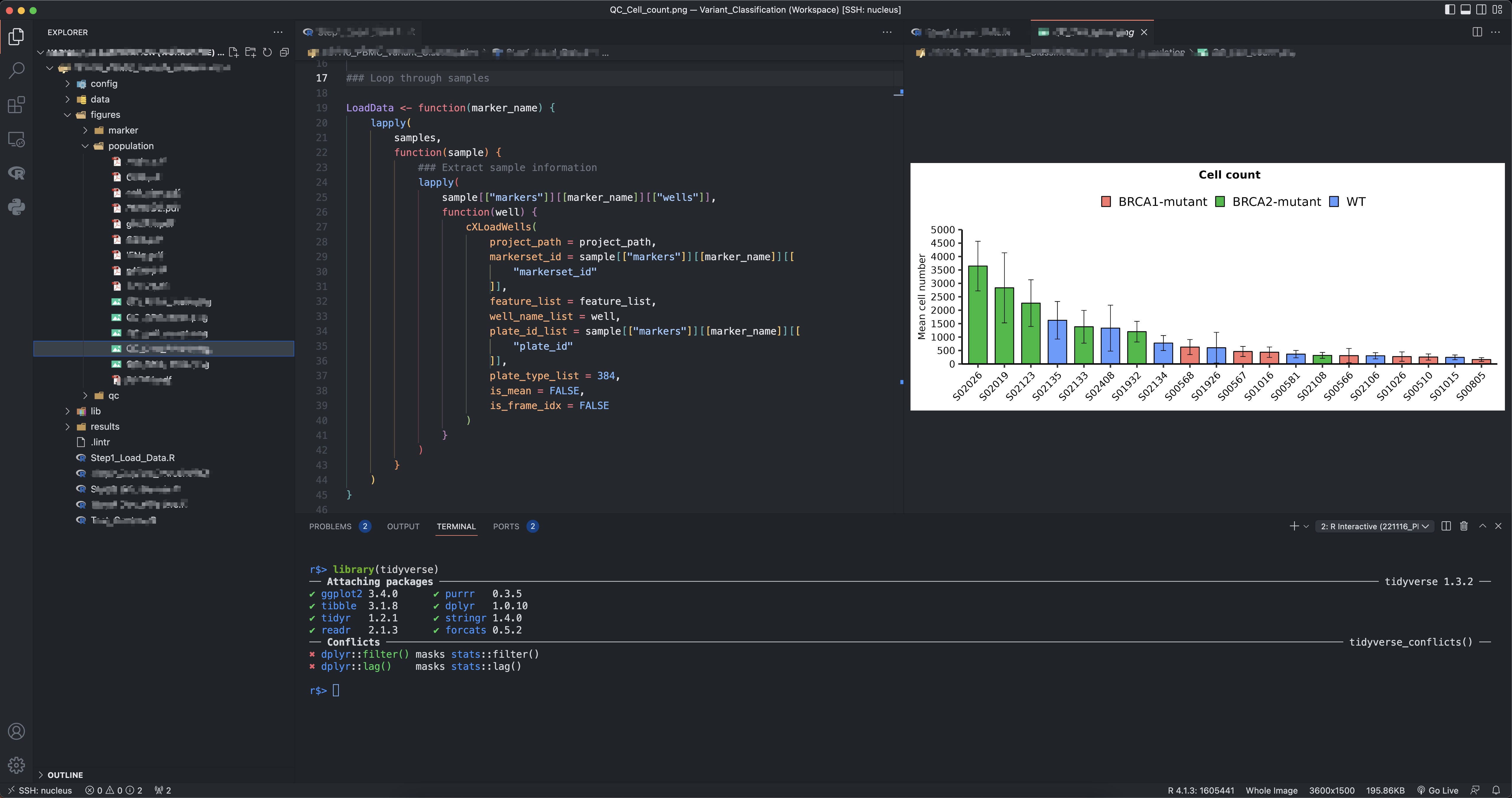
VSCode Keyboard Shortcut Cheat Sheet
The most useful VSCode shotcuts that can boost my productivity!

Learn Linux basic for computing
After working at Bioinformatics Institute for 3 years, I gradullly relizaed that it’s essential to learn Linux as:
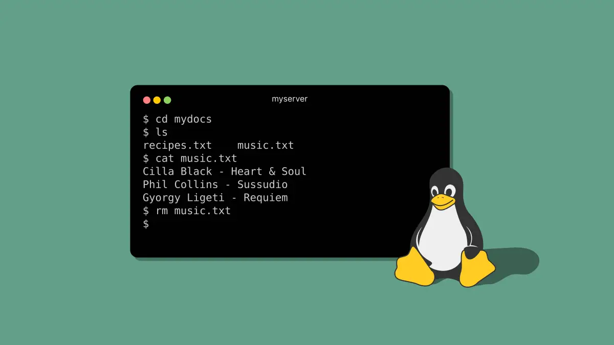
Modify components of a theme: https://ggplot2.tidyverse.org/reference/theme

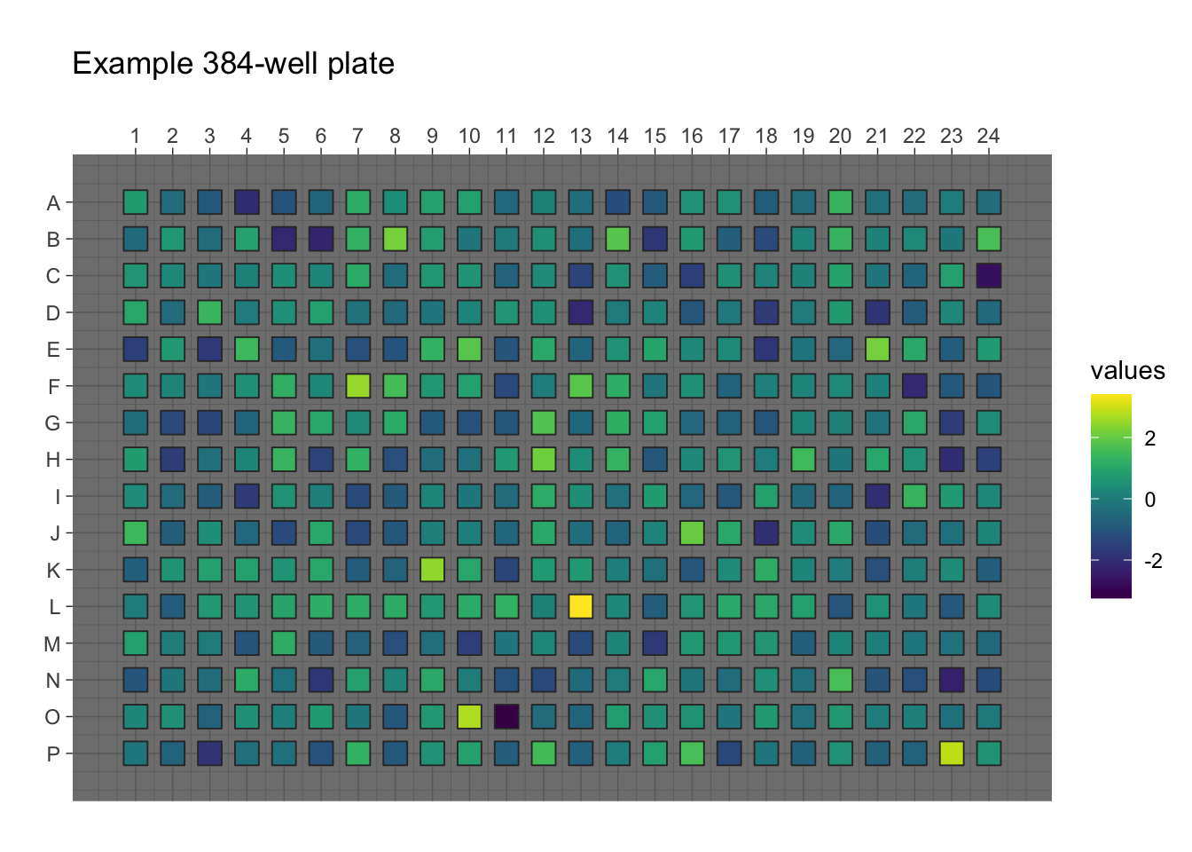
View data from 96/384 multi-well plates
plater makes it easy to work with data from experiments performed in plates.
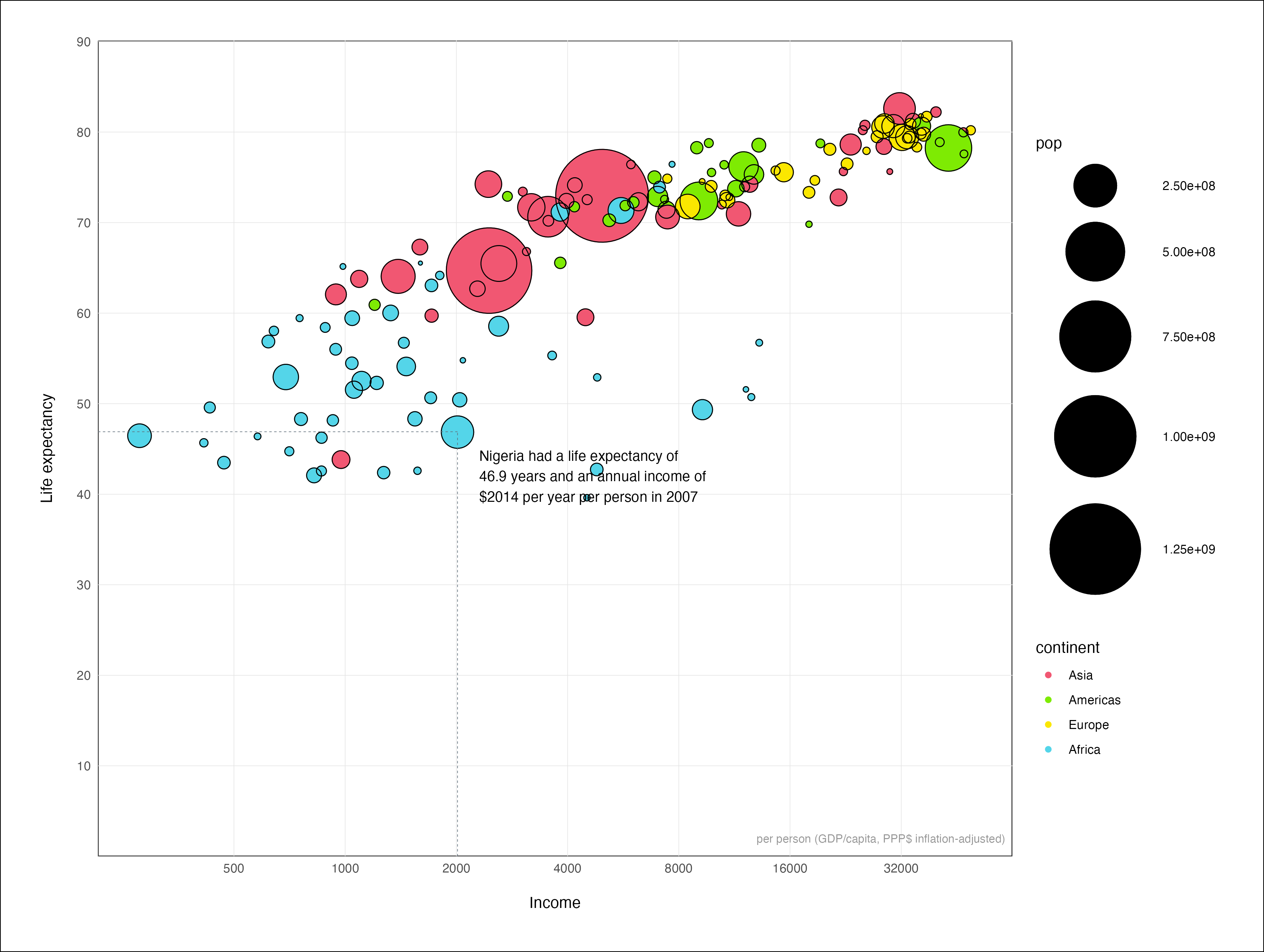
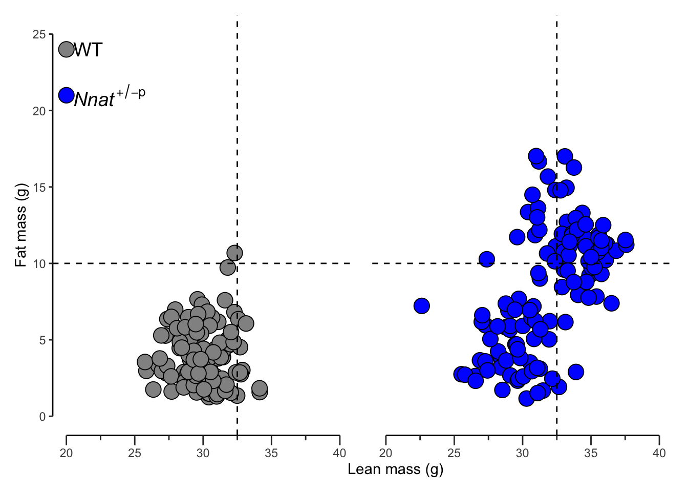
Make scatter plot with truncated axis
Make scatter plot more beautiful with truncated axis
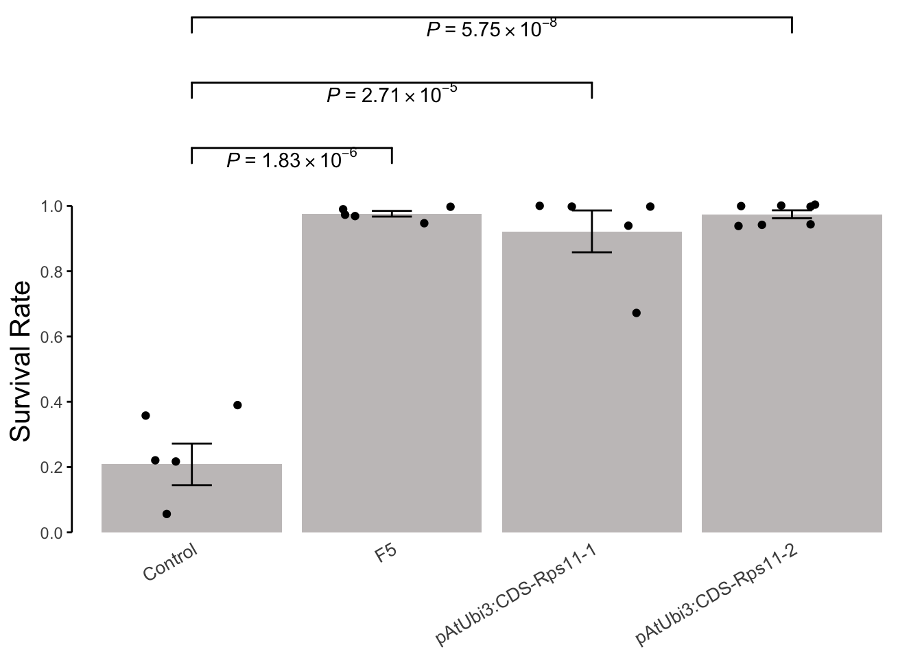
Add errorbar and p-value on barplot with ggsignif
Creating informative and visually appealing barplots is essential for data analysis and presentation. In this blog post, we will demonstrate how to add error bars and…
Use colorblind-friendly palette for visualization
Use friendly colors in a graph with ggplot2

2021
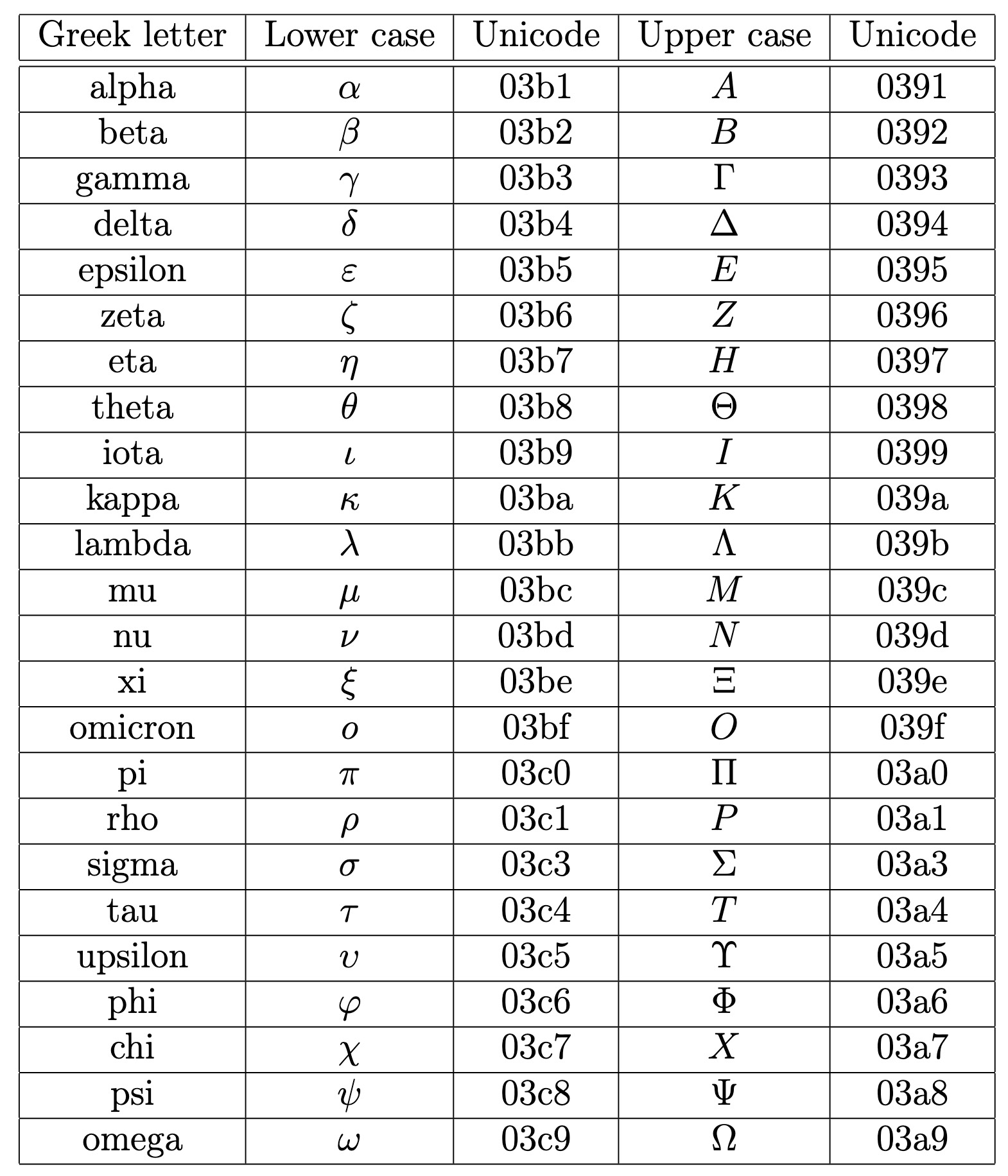
Using greek unicode in Inkscape
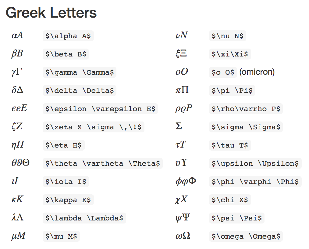
To get Greek letters in Inkscape, go into text mode and type Ctrl+U and the 4-digit unicode for the desired Greek letter.
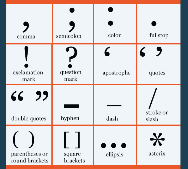
I don't know why i can not remember this English punctuation marks
